What is Web Accessibility? An Introduction for Developers
Learn how to write code that meets web accessibility standards, even if you just got started as a developer.


When I was first learning to code, I used to get overwhelmed by all the things I thought I needed to memorize — from JavaScript syntax to CSS properties to web accessibility standards. Adhering to web accessibility standards was especially intimidating. Despite the fact that web accessibility comes with enormous ethical and legal implications, it wasn’t widely discussed across the development community. When it came to writing code that met accessibility standards, it was hard for me to even figure out where to start.
Over time, and through my own research, I realized that there are communities out there with the aim of making the web accessible for everyone. On top of that, I learned that you don’t have to memorize all the requirements of web accessibility to write code that meets the standards. It turns out that searching for answers, rather than memorizing, is a normal part of development. Whether you’re a veteran developer or just getting started in tech, you can start integrating web accessibility into your code.
My aim in this article is to give you a solid introduction to important concepts around web accessibility, so you can make it a part of your coding practice from the start — and, hopefully, that you will join the community of developers who aim to make the web accessible to everyone.
In this article, we’ll cover:
- What it means to write accessible code
- What web accessibility standards are, and how can you meet them
- How you can create accessible websites, even if you’re new to tech
- Some accessibility barriers to keep in mind while coding
- How you can check your code for web accessibility
- Where you can learn more
What is web accessibility?
Web accessibility is the practice of ensuring everyone can perceive, operate, and understand web content. The heart of this practice is making the web accessible to people with temporary or permanent disabilities. There’s a lot that web designers and web developers have to consider when creating user interfaces and user experiences — everything from making text decipherable for low-vision readers to focusing content for users with motor impairments who primarily use the keyboard (two examples from Google’s accessibility developer docs).
“The power of the web is in its universality. Access by everyone regardless of disability is an essential aspect.” –Tim Berners-Lee, W3C Director and Inventor of the World Wide Web
Components of web accessibility
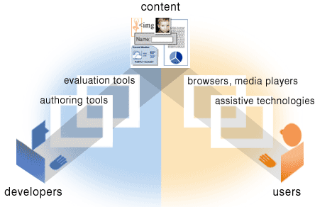
Before we can make sense of web accessibility, we need to talk about web content. You may know that web content is the information on a web page or app such as text, images, sounds, and videos. What may be surprising is that it also includes the code markup that defines the structure and presentation of the user interface. Markup includes HTML (HyperText Markup Language). So the `h1` header tag as well as the text of the title are part of what makes up web content.
Code gets interpreted by web browsers so that people can access web content on sites and apps. The content can then be interpreted by assistive technologies that improve usability of websites for people with disabilities. Assistive technologies include software or equipment like screen readers, voice recognition software that aids voice to text functionality, eye tracking devices, screen magnifiers, and more.
An illustration from W3C demonstrating how the different components of web accessibility work together.
What are web accessibility guidelines?
Let’s take a deep dive into the history of how accessibility guidelines came to be and how they continue to thrive. Brace yourselves for some acronyms!
The World Wide Web consortium, commonly referred to as W3C, is a community that determines international web standards. The W3C’s Web Accessibility Initiative (WAI) is a driving force when it comes to developing accessibility standards, supporting the web community with information and materials, and welcoming participants who want to support web accessibility.
In 1999, W3C published accessibility guidelines for developers, designers, and web content creators. The web content accessibility guidelines, WCAG, are in their second version, 2.1 specifically, and are split into four principles – Perceivable, Operable, Understandable, and Robust (POUR).
- Perceivable guidelines require different components of the page to be identifiable.
- Operable guidelines are all about making sure that components like navigation are usable.
- The guideline’s third section is around making instructions, image descriptions, and the like understandable.
- Finally, the guidelines indicate that web content should be robust, meaning it works across different user agents and assistive technologies.
The guidelines are fundamentally a set of standards developers and designers should refer to to make sure they’re creating accessible web content. So they’re an incredible resource to the tech industry.
A timeline of Web Accessibility Milestones from The History of the Web Website
While W3C operates internationally, web accessibility is also part of U.S. law. The American Disabilities Act (ADA) became a civil rights law in 1990 to protect those with disabilities. Title III of this law, which centers around public accommodations, has been understood to include equal access to websites. In addition to the American Disabilities Act, amendments to the Rehabilitation Act in 1998 enforced that government and federal agency websites should be accessible.
How can you create accessible websites, even if you’re new to tech?
So, how can you make the web more accessible to people with disabilities if you’re new to the scene? Creating an accessible website is possible even if you’re just starting to learn how to code or design.
Use clear language
In fact, one part of the accessibility practice does not require knowing how to code at all. It’s simply using clear language. Writing without making assumptions is key to writing clearly. For example, aim to expand acronyms before using abbreviations. Expanding other abbreviations, like months, when displaying dates is also helpful for screen readers to process your site information accurately. Another writing shortcut to avoid is dashes. So opt for March instead of Mar and instead of writing 3-4 go for 3 to 4. Clear language is also important to accessibility in writing labels for forms, text for buttons, and other instructions.
Use semantic HTML (HyperText Markup Language)
You also have the power to make sites accessible by writing semantic HTML (HyperText Markup Language). To write HTML semantically means using the most descriptive and suitable elements in relation to the content.
For example, while `div` might work, `h1` is more descriptive, and therefore easier for screen readers and other technologies to interpret correctly.
Left: non-semantic HTML, Right: semantic HTML
These two versions of the same content will render onto a web page. However, the right side is more semantic and descriptive. A screen reader will be able to decipher that there is a header, main content which includes an article, subheadings, and a button due to the corresponding HTML elements. Using descriptive elements makes the operable parts of the content clearer. In the above example, the semantic HTML makes it clear that there is a button on the page.
Use descriptive alt text
While writing HTML, keep in mind the possible attributes of elements that will further allow assistive technology to interpret the page. One way to aid screen readers is to provide text alternatives. For instance, when including an image in your website, use the `alt` attribute of the `img` element to provide a description of the image. This way, the screen reader can convey the information in the alt text to a user who possibly could not discern the image otherwise. If you need to provide more information to the image, you can use the title attribute.
An HTML example of using alt text for an image
Where possible, you can be even more descriptive, like this:
More descriptive alt text can make for a better user experience
For more resources and best practices, try Moz’s guide to alt text for images.
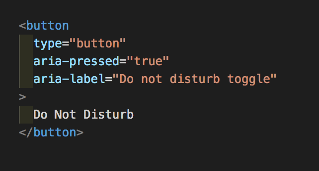
You can make your page further accessible with Accessible Rich Internet Applications (ARIA). Accessible Rich Internet Applications are helpful to describe the state, role, type of an element, and more that are not available with basic HTML.
An HTML example of using ARIA for a button
The above example uses ARIA denoted by the aria before pressed and label. The aria-pressed=true indicates that the button is in a pressed or “on” state. A screen reader will be able to read out that the “Do not disturb toggle, Toggle button, pressed.” For a deeper dive, checkout the WAI’s documentation specifically for authoring ARIA practices.
What accessibility barriers should designers and developers keep in mind when building websites and web applications?
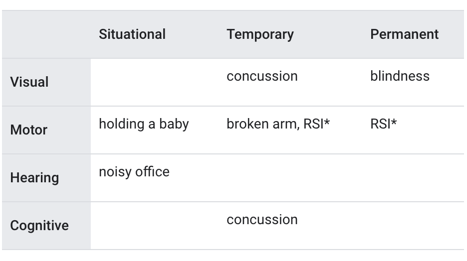
The 1 billion people globally that experience some form of disability are of course a diverse group of people. With the aim of being inclusive, designers and developers think in terms of four main buckets when considering impairments — cognitive, visual, motor, and hearing. Also, it is important to bear in mind that impairments can be permanent, situational, or temporary.
From Google’s Developer Accessibility Documentation
Methods of decreasing cognitive load are generally helpful for cognitive impairments. One type of cognitive impairment is dyslexia. According to the Bureau of Accessibility’s article How to Create Accessible Content and Designs for People with Dyslexia, using simple fonts, keeping text decoration to a minimum, and having an ample amount of space between paragraphs and lines can help the reader process information. These techniques are generally helpful for other cognitive impairments as well.
When designing for individuals with visual impairments, knowing how to use color and text is crucial. Text should be decipherable by screen readers, there should be significant contrast between the foreground and background, and color should be stark but not relied on heavily to convey important information.
People with motor and visual impairments may rely only on the keyboard to navigate a web page. In order to ensure keyboard accessibility, allow the user to navigate the site using the tab button. When navigating, the element that is the current point of focus needs to be clear to the user. Think of a form with many inputs for example. The user should be able to use the tab button to go from one form input to the other. While doing so, it should be clear to the user which input they are currently on and ultimately be able to submit the form.
Closed captioning is a primary way to make accessibility a reality for those who have hearing impairments.
How can you check your code for web accessibility issues?
As developers, we can write semantically, use ARIA, and more — but we won’t know how the site works for our intended users until we test it. One thing you should do to test your site’s accessibility is use a screen reader to test your code. Each browser and/or operating system should have a default screen reader: VoiceOver in Safari, NVDA in Firefox, JAWS in Internet Explorer, ChromeVox for Chrome.
Another way to check your code for accessibility problems is to only use the keyboard. This includes ensuring the correct elements are focused and can be operable while traversing the page.
Thankfully, there are tools like the following to help you design and develop with accessibility in mind.
Free web accessibility checkers and tools:
- Choose a color palette that’s accessible with Google’s Material.io tool
- Test your webpage with this color contrast validator
- WAVE is an amazing accessibility checker developed by WebAIM to determine accessibility compliance
- Here is a longer list of developer tools for building with accessibility in mind by Jake Tracey
A beginner’s accessibility checklist:
- Clear language: Check that acronyms appear expanded a few times before defaulting to the acronym alone, dashes are avoided, and instructions are provided
- Semantic HTML: Ensure HTML elements match their content and give insight to content structure
- Text Alternatives: Confirm that images have alt text to describe the content
- Use an Accessibility Checker: Determine the accessibility conformance of your webpage using an accessibility checker like WAVE
- Test with a Screen Reader
- Zoom in: Magnify your website to see that functionality remains and that the content still flows well within different devices’ screens
This is a checklist to start developing with accessibility in mind so that writing semantic HTML, for example, becomes a habit. If you are ready for a more encompassing checklist, you can use WebAIM’s or the Web Consortium’s Accessibility Guidelines itself.
Where can you learn more?
Unfortunately, few engineers are taught about web accessibility standards or the ethical and legal implications of disregarding them. So if you’re just getting started in tech, you may have to do some of your own research. Here are a few resources to check out:
- Google’s Accessibility Developer Docs
- React-specific Accessibility Docs
- Microsoft’s downloadable inclusivity Toolkits
- UX Designer Regine Gilbert’s book Inclusive Design for a Digital World
- Compliance expert Kris Rivenburgh, who covers web ADA compliance
A site is never going to be perfect, especially as deadlines come up and priorities change. However, you have the power to keep thinking about your user and to build for them. So any step you can make towards helping your user perceive, operate, and understand your space of the web — take it.

Neely Kartha
Category: Backend Developer, Blog, Entry Level Tech Jobs, Front End Developer, Full Stack Developer, Learn to Code


