Typography: Web Design’s Best Kept Secret
Take your web design knowledge up a notch with typography.

It’s two hours before the big presentation and something in your graphic design just isn’t… right.
The content is accurate. The word choice is excellent. The layout is satisfactory. The colors are striking. The images convey your message. But you’re missing the last component to tie the entire project together.
Oh! What about the design’s typography?
Typography is often overlooked in graphic design, web design, and elsewhere. Typography is a subtle yet pivotal design discipline that can make or break your design. And creative use of fonts, beyond our wildest serif or sans serif dreams, can be powerful.
In this web typography guide, we’ll break down the typography definition, and explain why it’s important for designers to know and learn the typography basics.
Table of Contents
- What Is Typography?
- Why Is Typography Important?
- Web Typography Elements
- Designing Typography for the Web

What Is Typography?
Simply, typography is the art and technique of arranging type. “Type” in typography applies to:
- Typeface
- Point size
- Line length
- Line spacing
- Letter Spacing
- Kerning
Clear in its definition, typography is a practice that reaches several millennia. The first typographers (although they may not have called themselves so 😮) used stamping dies, individual letter tiles, and movable type to create uniform currency, seals, and text as early as the second millennium. Typographers saw a big evolution in text with the invention of the mechanical printing press in 1439. Several technologies came after the mechanical printing press, including camera-ready typesetting and dry transfer technology. But make no mistake! Typography isn’t just for printing words in books and newspapers.
The first personal computers in the mid-1980s allowed designers to create the first digital typeface. Even though the technique used to arrange type has changed with advances in technology, the goal is the same. Web designers and graphic designers today arrange type to create legible, readable, and visually appealing digital applications.
📌 Related Reading:
Why Is Typography Important?
Typography is important for several reasons: readability and legibility… but there’s another reason why designers are especially concerned with the visual appeal of a typeset. Brand identity.
Typography, like a logo and color scheme, is a part of a brand’s identity. Brand identity is the visual aspects that make the brand or organization recognizable. And every decision a web designer makes is an opportunity to leave an impression on the user.
McDonald’s has its famous golden arches logo. Google’s four branded colors — blue, red, yellow, and green — are simple yet memorable. The New York Times’ attention-grabbing Old English blackletter font is unmistakable.
Good typography is beautiful, readable, and legible. It also leaves an impression that ironically words can’t describe.

Web Typography Elements
First, let’s lay the groundwork — the elements of typography:
Typeface and Font
You might see typefaces and fonts used interchangeably across the internet. Let us be the first to correct this easy mistake. Typeface and font are NOT the same, but they do work hand in hand.
- A typeface is the name of a typography style or family of styles applied to a text. In your everyday internet browsing you might encounter typefaces Arial, Calibri, Georgia, Helvetica, Times New Roman, and Verdana.
- A font is a digital file that contains a typeface and displays it on a webpage. Fonts describe the point size, font weight, and more. For example, “Arial bold 18pt” and “Helvetica Italic 10pt” are both fonts.
There are a few design typefaces that you should keep on your typography cheat sheet: serif, sans serif, script, and display.

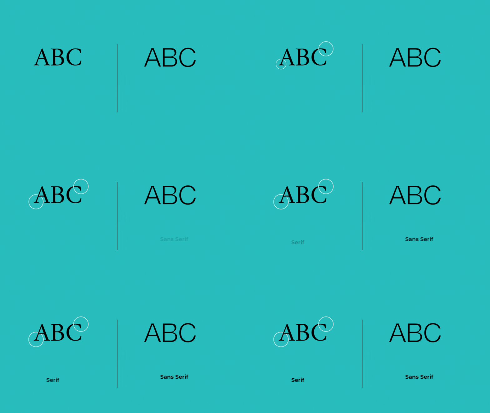
Serif typefaces have little “feet” or a serif. The “feet” subtly connect the letters, creating a visual connection and improving the readability of a text. Serif typefaces are perfect for large blocks of text you might see on blogs, newspapers, books, ebooks, and more.
Sans serif typefaces are typefaces without “feet.” San serif texts are clean and easy to read, so typically used for headlines and captions.
Display typefaces convey A LOT of personality and spunk. These typefaces are bold, unique, and perfect for building brand character. Display typefaces are used sparingly, as they demand attention but can be hard to read.
Script typefaces are one of the most self-explanatory typefaces. These typefaces closely resemble hand lettering. With its distinct loops and curls, script adds a personal touch that other computer-generated-looking typefaces can not. Be careful, however, like display typefaces, script can be hard to read in block text.
Of course, there are several other typefaces at your disposal like monospace; nonetheless, the previous four are the most commonly used.
Consistency
One of the quickest ways to increase your bounce rate is a sloppy, inconsistent typeset. Inconsistent typeset muddles the brand identity and jumbles the messaging. Consistent typesets follow a pattern in the same font family. In practice, a designer may use the same font for body text across a website and another for title tags to create predictable patterns that the reader can follow.
There are absolutely instances when it’s appropriate to break this guideline, but those are few and far between especially when considering the reader experience.
Alignment
Keep in mind that typography is more than just text. Typographers and designers also manipulate how that type appears on a page or website by adjusting other outstanding factors like line height and alignment.
Alignment is the process of composing different elements (text, images, etc.) to ensure equal spacing, sizing, and distance between elements.
There are four types of alignment:
- Left alignment, when text is aligned to the left margin
- Right alignment, when text is aligned to the right margin
- Center alignment, when text is aligned to the center of the text box
- Justified alignment, when text is aligned with both margins
Alignment is a visual and practical design decision. Alignment influences how a user interacts with a page, creating hierarchy and overall visual appeal. Language also impacts alignment. For example, Arabic and Hebrew are read right to left, while English is read left to right. Designers must balance the demands of visual and practical design that makes sense for their audience.
Color
If you read our color theory guide, you’ll know that color has a profound impact on a viewer’s perception. Masterful color combinations can influence behaviors, and communicate subliminally. Sure, you could stick with the standard black text that most opt for… or you can create an air of refined elegance with a gray-tone font or communicate your brand’s spunky attitude with a turquoise color.
Designers can create their own color combinations mixing hues, shades, tints, and tones, but do so with caution. Color is a fun way to add personality to a design, but it can also hinder the legibility and readability of a web design if done incorrectly.
White Space
White space is self-explanatory. It is the void or negative space on a page or website. The question is: why is white space important? In the context of typography and reader experience, white space vastly impacts the readability and legibility of a text. White space is created by adjusting:
- Line length
- Line spacing
- Letter spacing
- Paragraph spacing
Hierarchy
Hierarchy is a system of organization, where different design elements are used to distinguish between vital pieces of information.
Designers can create a hierarchy using font, color, and alignment. For example, a designer can establish a hierarchy by choosing a display typeface different from the rest of the typescale or center aligning the title to draw attention to the interesting, different text.
🔎 Take a closer look: Check out the hierarchy of this article. The hierarchy is established by header tags (H1, H2, H3) so you know where to start and how the article is organized.
Designing Typography for the Web
Designing a typography for a website can be immensely fun! You are subtly influencing a user’s perception of the brand. Though the design elements are subtle doesn’t mean it isn’t nuanced. There is an endless range of different elements to create an eye-catching brand identity.
We know. 😮💨 It’s very easy to get overwhelmed by the various moving parts, but don’t worry. Follow these simple steps to start your typography design.
📌 What is a typescale? A typescale is a collection of stylized fonts employed to establish a brand’s identity.
Create a Typescale
Start with a primary typeface to represent your brand. Keep in mind that your brand’s personality should guide this decision. This will be the dominant font in your typescale. After choosing a typeface, you should explore the countless fonts available in your chosen typeface until you find a font that represents your brand.
Before finalizing and publishing your typescale, make sure your typescale meets the following criteria:
- Suitable. Does the typescale accurately convey the mood and tone of your brand’s identity?
- Recognizable. Is the typescale distinctive and memorable?
- Legible. Is the typescale easy to read and understand at a glance?
- Versatile. Can the typescale be used across various platforms?
- Resonate. Does the typescale fit the target demographic?
If your typography meets these criteria, you’re on your way to establishing the perfect font for your brand.
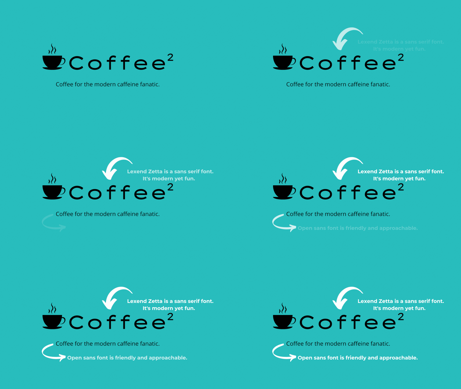
💡 Example: Coffee Shop Typescale

My up-and-coming coffee shop makes non-traditional coffee drinks for a younger generation, and I want to create an air of innovation and light-heartedness. I choose a sans serif font because it conveys friendliness and modernity. And after pouring over san serif fonts, I settle on Lexend Zetta for title text and Open sans for body text.
Examine Web Accessibility
Visual appeal and brand recognition should not override the accessibility of a typography design.
Legibility and readability are often discussed in design but not accessibility. Legibility measures the distinguishability of individual characters and words. Readability is a measurement of how easy a text is to read. Accessible font takes the two principles a step further and asks designers to consider the experience of those with disabilities, like users with low vision or dyslexia.
A few accessibility factors that designers should consider include:
- Text Color
- Text size
- Line Spacing
Web accessibility in terms of typography is a nuanced topic; Google’s “Introducing Accessibility in Typography” is a solid resource for further information.
A/B Test
After all your work, you should test your typography design to understand the overall reading experience. Usability testing is no secret in the realm of UI and UX design, but this practice should also extend to typography to ensure legibility, readability, and accessibility.
Typography is just ONE discipline underneath the wide graphic and web design umbrella. Along with UI design, UX design, visual design, and a slew of other disciplines, there are endless growth opportunities. If all things type is your jam, consider taking the three-minute tech quiz to see if design is the right career for you!


