What Is Microcopy? A Guide for UX Designers and Digital Marketers
Small but mighty. Copy for a new age.


Whether you’re working in digital marketing or on a user experience (UX) team, $20 says you’ve heard the saying: Content is king. Well today, we’re talking about our prediction for the next reign: microcopy.
As we wind down 2019 and head into a new decade (scary, I know), it feels like every tech company’s growth strategy now focuses on words.
There are conversations around accessibility (and how essential descriptive links are). Then there’s Google, which now rewards higher search rankings to sites that produce long-form articles and use user-friendly formatting. And of course, there are our attention spans, which are stretched so damn thin, you better believe those quippy headlines count.
So, content matters and content is everywhere—including, it turns out, in the tiniest pockets of the internet. And here’s the thing: as we look toward 2020, many UX professionals and digital marketers have realized that, often, the tiniest interventions are what make or break the user experience and customer conversions. Cue microcopy, also called UX microcopy, and the rise of bite-sized content.
Table of Contents
- What is Microcopy?
- 5 Microcopy Examples That Are Both Successful and Charming
- How to Write Great UX Microcopy: A Guide
What is Microcopy?
Before we take a deeper dive, let’s spend about 60 seconds getting everyone on the same page with a clear-cut definition of microcopy.
Microcopy: a definition
UX microcopy, also known simply as microcopy, is the catch-all term for the pint-sized bits of content on a website or application, on your sales pages and product pages, you name it.
Some common microcopy includes:
- Error messages
- Buttons
- Captions
- The small print at the bottom of a sales page
- Processing screens / 404 pages
- Thank you pages
- Tooltips
- That annoying GDPR message you get about sites storing cookies
- …and any other (often overlooked) copy that affects your experience when using a site
Trust, or Why Microcopy Matters
The basic idea is this: Microcopy exists for all those moments when a user needs to feel seen, heard, or understood. As the UX team at Adobe explains it, microcopy is everything:
“…from the words that comprise a call to action, to the disclaimers that assure users that their email address won’t be shared or stored.”
And for that reason, microcopy is a key component for building a trust-based relationship with potential customers.
Up until a few years ago, writing microcopy often fell to web developers or designers—or whoever was in charge of coding up a site. If someone realized an area needed clarification, they’d write some copy. The results were occasionally often egregious.
Frustration, or Why Bad Microcopy is Bad Business
Think about a time when you noticed a glaring spelling error on a checkout page. Or, worse, have you ever tried to fill out a form, missed something so you couldn’t submit it, only to struggle to figure out what you needed to correct?
That, right there, is a big old #microcopyfail.
With the rise of UX (and UX writing, specifically), we’ve also come to realize that the tiniest tidbits can make or break your customer’s experience. Microcopy is king.
If you’re still having trouble visualizing what microcopy is, let alone what it means for your work, we don’t blame you. Since microcopy is everywhere, it’s hard to visualize it in isolation. With that in mind, the best way of understanding it is to see in action. So let’s go through some microcopy examples, which we’ve pulled from brands that are doing it right.
5 Microcopy Examples That Are Incredibly Successful (and Incredibly Charming)
1. Everlane’s Radically Transparent Microcopy
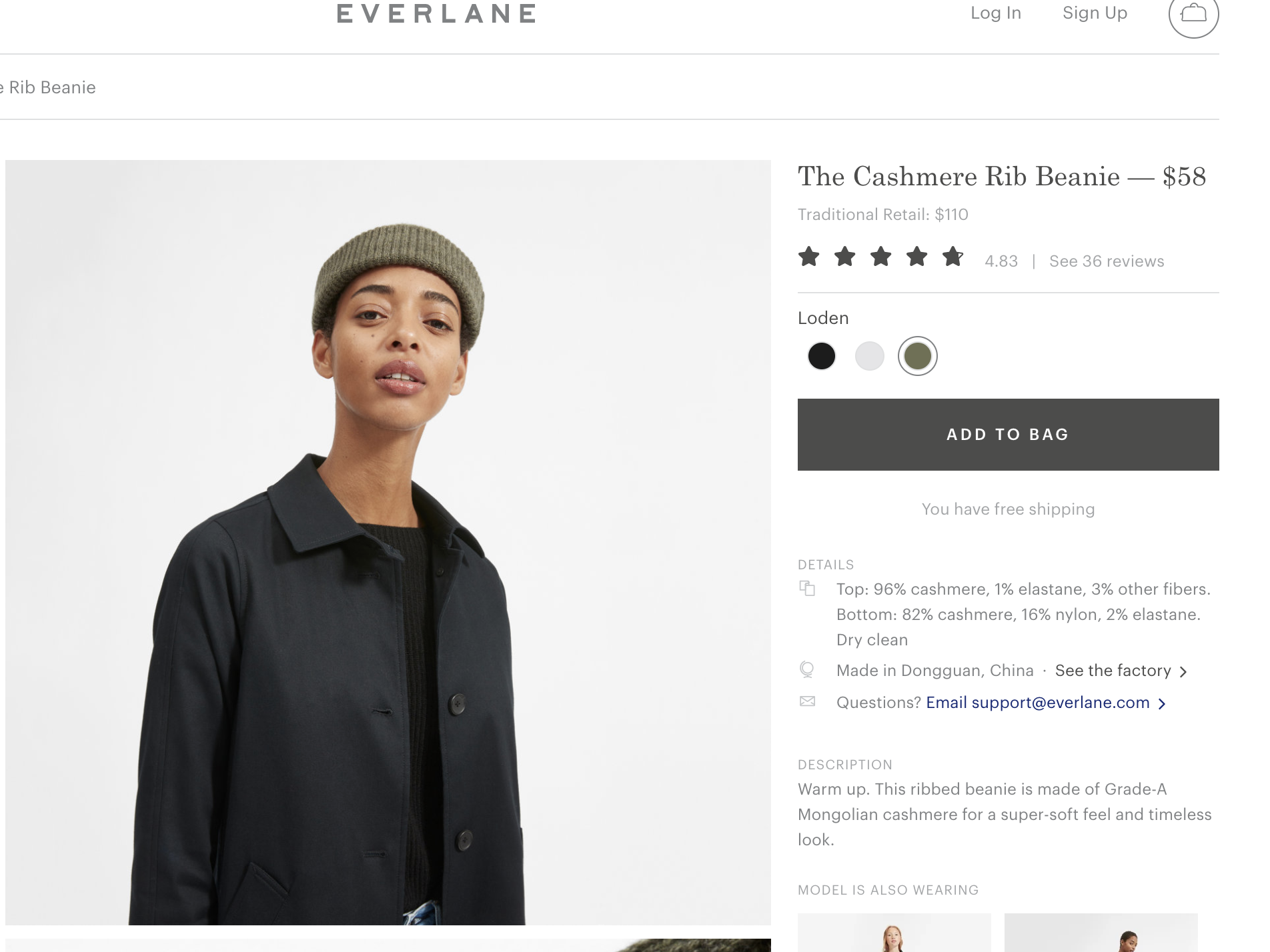
The fashion brand Everlane is built on a few key tenets including the company motto “radical transparency”. It’s applied that approach everywhere, including the fine print.
There are several great examples of microcopy on this sales page. See:
- The “traditional retail” copy directly underneath Everlane’s price.
- The “You have free shipping” message directly below the Add to Bag CTA, which makes it that much more appealing to throw this beanie in your cart.
- Heck, that brings up another great example: “Add to bag” which feels much cooler and informal than “Add to cart”—exactly in line with Everlane’s voice and tone.
- See that “See the factory” CTA under details? This microcopy proves that Everlane practices what it preaches right down to the see in the microcopy—a word that immediately brings transparency to mind.
2. Mailchimp’s Anti-Frustration Approach
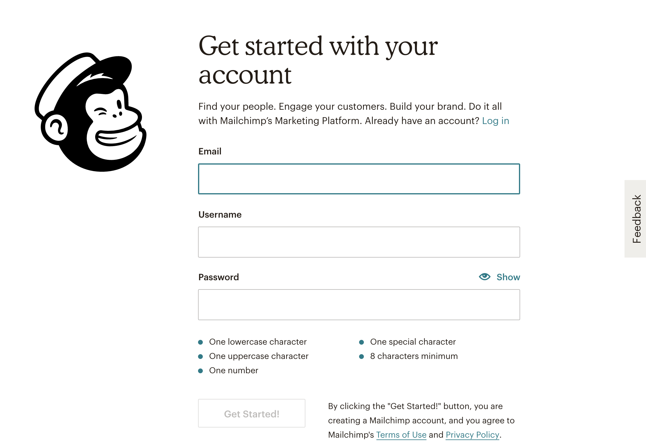
In part thanks to its fantastic style guide, Mailchimp is renowned for its approach to content, including UX writing, so it’s little surprise that the team took its UX microcopy very, very seriously. Take this account sign-up page.
- Think of all the times you’ve set up a password only to receive an error message that you need “at least one capital letter”. Using microcopy, Mailchimp puts those requirements front and center so you don’t have to go through the frustration of starting over.
- Who doesn’t love a “show” option?
- Check out that “Get Started!” CTA. Mailchimp wants you to feel excited—and also to understand that there’s plenty of more exciting stuff to come.
- And then there’s that Feedback tab, just in case you see something you don’t like. Mailchimp is telling you that they want to hear from you, that they’re open to feedback, that they can empathize—all before you’ve even given them your information.
3. WeTransfer’s Creative GDPR Solution
Look, if you’re a big company, you’ve dealt with the new GDPR rules. It’s annoying and wreaks havoc on both your conversion rates and reporting. We know. But when life gives you lemons, why not make lemonade?
WeTransfer’s GDPR popover plays ups all of its great features and, of course, gives you a big old welcome. But it also lets you see what your future experience will be like with that “Add your files” graphic. All you have to do is click “I agree.”
4. Oatly’s quippy, punny, personal marketing copy
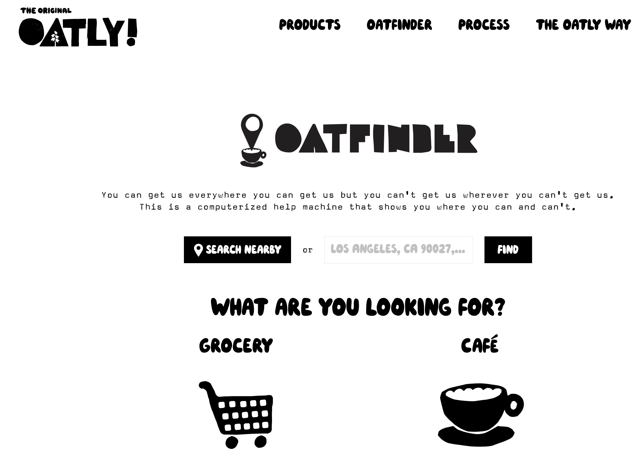
There’s a reason why my local coffee shop had an Oatly shortage—everyone wanted it and no other sad oat milk alternative would do. You don’t get that kind of loyalty without paying attention to your UX microcopy. Here’s a great example of Oatly’s attention to detail:
- Check out the clever slug copy that makes light of the search functionality (ahem, “computerized help machine”) while also helping you get where you’re going as fast as possible.
- See how it automatically added my general location to the search bar, too?
- And then there’s the attention to persona and user need. Some of us want our Oatly at home, others are after the perfect oatmilk capp. Oatly has set up its map page to let you pick between grocery stores and cafés right away.
- And then there’s this:
Why shouldn’t your site description speak directly to the reader? Hey, Oatly, it’s me, your latest convert.
5. Glossier’s Less-is-More Meets Tell-All Approach to Microcopy
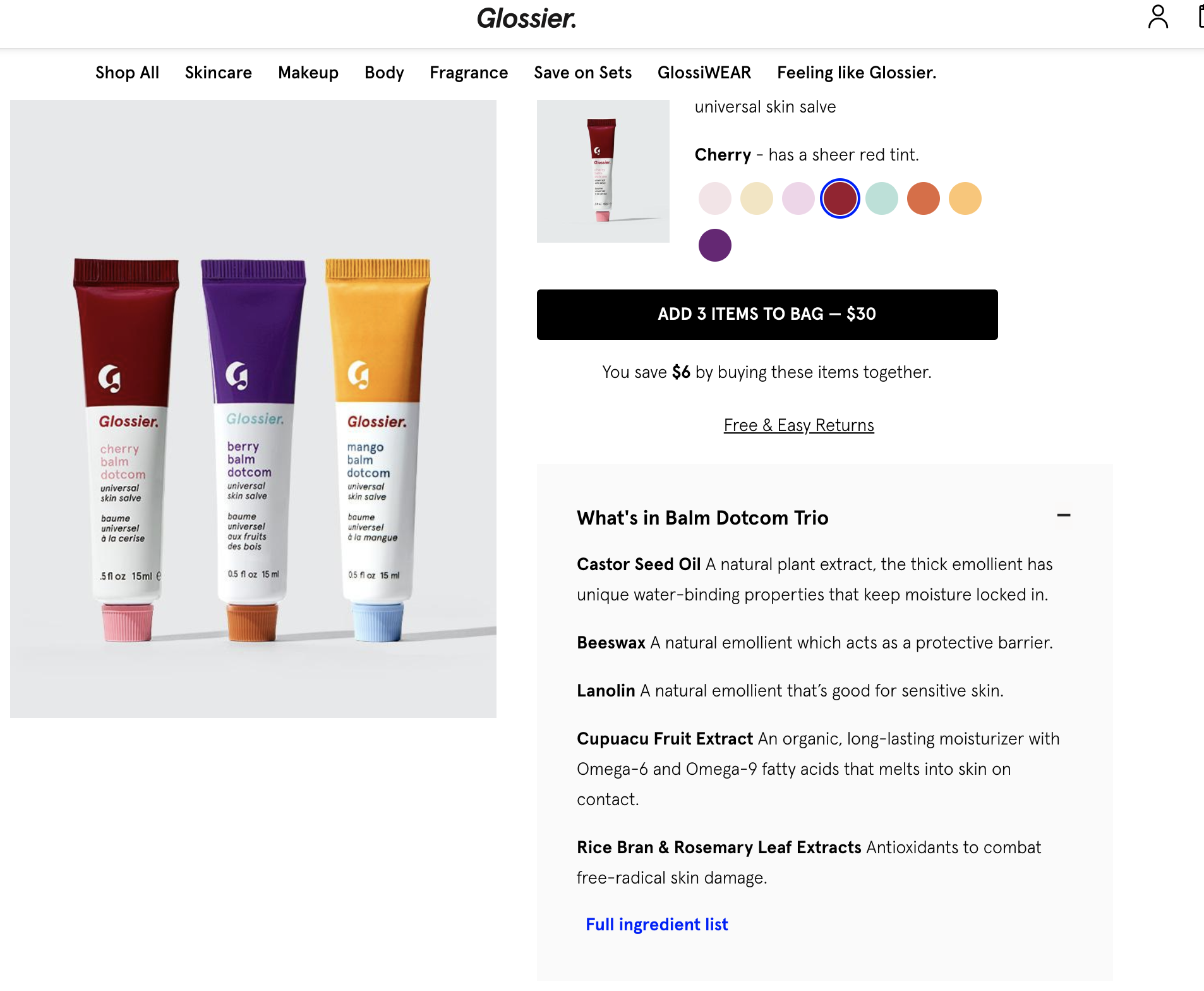
It doesn’t get much more charming than Glossier, content-wise, which makes sense considering the brand sprung from the minds of the Into the Gloss team—you know, the ones who built an empire writing beauty-related content. Here’s what stands out about Glossier’s microcopy on its sale pages:
- A clear callout to “free & easy returns” sets your mind at ease before buying from an online brand, but the team doesn’t bog down the sales page with the nitty-gritty. If you want to see the full policy, it’s easy enough to click.
- Check out the “What’s In It” section. Glossier chooses to highlight what it considers the most important ingredients of each product and explain why it’s used them—yep, much like Everlane, Glossier loves transparency! This is particularly helpful with those mouthful ingredients that turn up in all the beauty and skincare products. You can get a quick overview of what they (purportedly) do.
- Still, Glossier gets that people (especially those with allergies! Cough, cough.) will want to see all the ingredients. And yes, legally, it has to disclose them as well. Cue the “Full ingredient list” link. Start with the essential info, then let people dig deeper through great microcopy.
How to Write Great UX Microcopy (And Micro Marketing Copy): a 4-Step Guide
1. Know Your Brand—And Your Personas
You can’t write great microcopy if you don’t understand your audience from their problems to their passions. This is a truism of UX and great digital marketing, but it’s also essential for great UX microcopy.
As you work on marketing, sales pages, or new features on your app, think about how every piece of copy speaks to your audience. Is it in line with your brand? Or are you rushing through the “small stuff” and missing valuable opportunities to make your visitor’s experience better?
If you don’t have voice and tone guidelines in place for your brand, you should. If there’s one thing the five brands above have in common, it’s the strength of their brand voice. It’s much easier to write marketing copy—microcopy or macrocopy—if you’ve got a cohesive brand.
2. Think About Problem Zones
Most great microcopy solves for problems. Users are nervous about sharing their information. They’re frustrated when they can’t remember their passwords. They’re confused if they click “Buy” but never land on a thank-you page.
What are your site’s (or your app’s or marketing materials’) problem zones? How could you make them less painful?
3. User Test—Then Test Again
In its 2016 Medium piece on microcopy (“The Devil is in the Details” is the perfect title, BTW), SaaS company Usabilla argues,
“One way to test your copy is to pay attention to the actual words people use during usability study sessions. Listen closely and take note of the phrases they use to describe the actions they take, alongside the general comments and chit-chat they make in the room.”
Often, we think we know what’s going on in a users head, but any UX person will tell you: We don’t. As you’re working on improving your microcopy, try a few UX and see what happens.
4. Bookmark (and Memorize!) Adobe’s 4 Cornerstones of Microcopy
Adobe is the master here, so why reinvent the wheel? The “cornerstones” are (briefly summarized) as follows:
- Brevity – It’s called microcopy for a reason, so Adobe advises you keep it to the point.
- Context – Adobe argues that giving users enough background to situate themselves empowers them, which in turn builds trust
- Action – As Adobe puts it, “Whether it’s to get the user to click a button, to provide you with information such as an email address, or to simply keep them engaged and on the page, each word has a purpose.” Even the smallest copy needs a purpose—otherwise, it’s just fluff. And we’re too busy for that nonsense.
- Authenticity – Look, you’re a content person (or a UX professional, but same-same), so you don’t need to be convinced here. Content is king but authenticity? It’s queen. And here at Skillcrush, we’ll take our queens over everything.
Adobe breaks each of its cornerstones down in detail in this dedicated article. We highly suggest you do a deeper dive. Use them, and you won’t go wrong—not even in the tiniest way.
Scott Morris
Category: Blog, Digital Marketer, Entry Level Tech Jobs, UI/UX Designer


